Featured Content Components
Below are examples of component at default width (filling parent container). See an example of the component breaking out to full screen width on the Home Page .
Image Position Variations
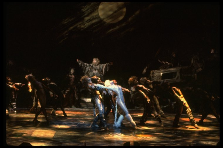
Featured
Image at End
The New York Public Library recently enhanced access to all public domain items in Digital Collections so that everyone has the freedom to enjoy and reuse these materials in almost limitless ways.

Featured
Image at Start
The New York Public Library recently enhanced access to all public domain items in Digital Collections so that everyone has the freedom to enjoy and reuse these materials in almost limitless ways.
Image Width Variations

Featured
Image Width 1/4
The New York Public Library recently enhanced access to all public domain items in Digital Collections so that everyone has the freedom to enjoy and reuse these materials in almost limitless ways.

Featured
Image Width 1/3
The New York Public Library recently enhanced access to all public domain items in Digital Collections so that everyone has the freedom to enjoy and reuse these materials in almost limitless ways.

Featured
Image Width 2/3
The New York Public Library recently enhanced access to all public domain items in Digital Collections so that everyone has the freedom to enjoy and reuse these materials in almost limitless ways.

Featured
Image Width 3/4
The New York Public Library recently enhanced access to all public domain items in Digital Collections so that everyone has the freedom to enjoy and reuse these materials in almost limitless ways.
Text Content Variations

This text should have a header. This text should have a header. This text should have a header. This text should have a header. This text should have a header. This text should have a header. This text should have a header. This text should have a header. This text should have a header.

Not recommended
This does not fill the space and could use more.
Demonstrating container queries
The default styles of the FeaturedContent component use a row (horizontal) layout, but the responsive styles are adjusting based on where each card is rendered.
Responsive styles based on container queries are updated based on the width of an element's parent container. They are not adjusted based on the width of the viewport. For example, the component in the narrow mimiced "sidebar" is rendered using a column (stacked) layout, while the component in the wider "main content" area is rendered using the expected row (horizontal) layout. The components know to do this because styles set using container queries look at the width of the parent container and not at the width of the viewport.

Sidebar
About Cats
The New York Public Library recently enhanced access to all public domain items in Digital Collections so that everyone has the freedom to enjoy and reuse these materials in almost limitless ways.

Main content
More Cats
The New York Public Library recently enhanced access to all public domain items in Digital Collections so that everyone has the freedom to enjoy and reuse these materials in almost limitless ways.